

Why Your Landing Page Converts at 2%
Your landing page is broken. Not because the headline is weak. Not because the CTA button is the wrong color. The page is broken structurally — before anyone reads a single word.
Most marketers fix landing pages the way mechanics fix cars by repainting them. They swap headlines. Test button colors. Tweak the CTA copy. Meanwhile, the engine is missing three cylinders.
This post teaches the convergence framework — how six independent landing page methodologies collapse into seven architectural principles, ranked by agreement strength. When all six frameworks agree on a rule, violating it is structural failure. When only three agree, it's a strategic choice.
By the end, you'll know how to audit any landing page against the convergence gradient, identify which layer is broken, and fix it in priority order. This is the framework MarketerX runs automatically on every landing page it generates.

The Convergence Gradient: What All Six Frameworks Agree On
Six independent landing page frameworks exist. Each comes from a different practitioner, optimized on different traffic sources, for different offers. But when you map their principles side by side, patterns emerge.
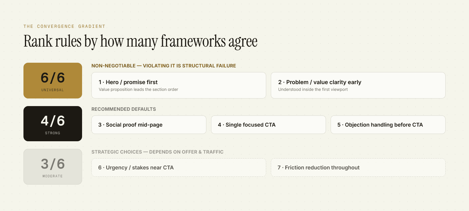
Three convergence levels separate non-negotiable structural rules from strategic choices:
6/6 Universal Agreement — Non-Negotiable
Principle 1: Hero/promise FIRST in section order.
Every framework puts the value proposition at the top. AIDA starts with Attention (the promise). PAS starts with Problem (which sets up the promise). StoryBrand starts with the Hero Headline. CCD's Focus principle demands clarity on what you're offering before anything else. MECLABS weights Value (v) at ×3. LIFT puts Value Proposition as the foundation that sets the ceiling for every other optimization.
If your page starts with "About Us" or a mission statement, you've violated 6/6 agreement. The visitor doesn't know what you're offering or why they should care. That's structural failure.
Principle 2: Problem/value clarity EARLY in the page.
All six frameworks agree: if the visitor doesn't understand the problem you solve or the value you deliver within the first viewport, they leave. MECLABS found that "Above Average" vs. "Below Average" landing page experience (clarity being the dominant factor) produces 87% higher CTR and 750% higher conversion rate.
85% of visitors decide to continue or leave in the first 10 seconds. Clarity early isn't stylistic polish. It's structural survival.
4/6 Strong Agreement — Recommended Defaults
Principle 3: Social proof mid-page.
Four frameworks (AIDA's Interest, StoryBrand's Success Stories, CCD's Trust, LIFT's Anxiety Reduction) place social proof after the value proposition but before the CTA. Two don't prescribe placement.
Mid-page placement makes sense: visitors need to understand WHAT you're offering before they care WHO uses it. Testimonials above the headline are decorative. Testimonials after you've explained the transformation are proof.
Principle 4: Single focused CTA (1:1 attention ratio).
CCD's signature principle: every page should have exactly ONE conversion goal. Multiple CTAs are fine IF they all point to the same action (three "Start Free Trial" buttons scattered through the page = compliant; one "Start Free Trial" + one "Contact Sales" + one "Subscribe" = three competing goals, violation).
The 1:1 ratio comes from analysis of 50,000+ pages. Pages with competing conversion goals split attention and degrade performance on all goals.
Principle 5: Anxiety/objection handling before CTA.
Four frameworks prescribe this (LIFT's Anxiety factor carries negative weight equal to Incentive; MECLABS' a-factor is subtracted; StoryBrand's Plan section addresses fears; PAS's Solution section includes proof). Removing anxiety is mathematically equivalent to adding incentive — often easier and cheaper.
3/6 Moderate Agreement — Strategic Choices
Principle 6: Urgency/stakes near CTA.
StoryBrand prescribes a "Stakes" section (what happens if the visitor doesn't act). AIDA's Action step includes urgency. CCD doesn't mandate it. MECLABS doesn't include it. LIFT's Urgency is a driver but not weighted as heavily as Value or Clarity.
This is framework-dependent. Story-driven audiences respond to stakes framing. Utility-driven audiences (B2B SaaS, paid search with declared intent) often don't need it.
Principle 7: Friction reduction throughout.
CCD's Friction Reduction principle. MECLABS' f-factor (subtracted at ×2 weight). LIFT doesn't call it out as a top-level factor. AIDA/PAS/StoryBrand don't prescribe it.
Friction matters most on forms and checkout pages. On a simple opt-in page (email for PDF), friction reduction is structural. On a brand-story-driven page for a coaching offer, friction tolerance is higher because the visitor is engaged in a narrative.
The Page Length Decision: 8 Factors, Ranked by Evidence Strength
Page length is the most consequential pre-generation decision. It determines section count, fold strategy, CTA placement, and persuasion depth.
Most marketers guess. Or default to "shorter is better." Here are the eight factors that actually determine optimal length, ranked by corroboration strength across studies:
Factor 1: Awareness Stage (Highest Corroboration)
Eugene Schwartz's awareness taxonomy is the dominant variable. Five independent practitioners cite it as the #1 length determinant.
- Most Aware (visitor knows your product, ready to buy) — shortest page. Compress to essentials: offer + CTA + trust signals.
- Product Aware (knows the category, comparing options) — medium-short. Show differentiation quickly.
- Solution Aware (knows solutions exist, hasn't picked one) — medium-long. Explain your approach.
- Problem Aware (knows they have the problem, doesn't know solutions exist) — long. Educate on the solution category first.
- Unaware (doesn't know they have the problem) — longest. You're building awareness from scratch.
Moz case study: a page 6× longer than the control produced 52% conversion improvement = $1M additional annual revenue. Why? The short page mirrored a 1-minute elevator pitch. The long page mirrored a 5-minute consultation. The traffic was Problem Aware — they needed education, not a quick sell.
Factor 2: Traffic Temperature (High)
- Hot traffic (retargeting, email subscribers, abandoned cart recovery) — short. They know you. Remind and close.
- Warm traffic (content site visitors, engaged social followers) — medium.
- Cold traffic (paid social, display ads, cold outreach) — long. You're starting from zero trust.
Unbounce benchmarks: email traffic converts 60% better than paid social. The traffic source isn't just volume — it's the amount of context the visitor brings. Email traffic arrives with context. Paid social traffic arrives with skepticism.
Factor 3: Price Point (High)
- <$100 — shorter.
- $100-$500 — medium.
- >$500 — longer. Higher commitment = more justification required.
Factor 4: Product Complexity (High)
- Simple product (PDF download, newsletter signup, commodity purchase) — short.
- Requires explanation (SaaS with novel workflow, done-for-you service, technical product) — long.
If you can't explain what you're selling in one sentence, the page needs room to build comprehension before asking for the sale.
Factor 5: Form Fields (Medium-High)
The more fields you're asking the visitor to fill out, the more justification you need above the form.
Baymard Institute analyzed 4,400 checkout sessions. Reducing fields from 11 → 4 produced a 120% conversion lift. But when field count is fixed (you legitimately need the information), page length must increase to justify the ask.
Factor 6: Traffic Source (Medium)
- Paid search — shorter. The visitor declared intent by searching. Match the query and close.
- Paid social — longer. The visitor was scrolling. You interrupted. Earn the attention.
Factor 7: B2B vs. B2C (Medium)
B2B pages trend longer. Multiple stakeholders, higher stakes, longer sales cycles. A $50K enterprise software sale needs more justification than a $50 DTC product.
Factor 8: Device (High)
50% content reduction on mobile = 59% conversion improvement (cross-vertical study).
Mobile users have smaller screens, thumb-zone constraints, and lower patience for long-form content. The same page that works on desktop fails on mobile if you don't compress.
The Decision Protocol
Don't guess. Work through the factors in order:
- Determine Awareness Stage → sets base length
- Assess Traffic Temperature → adjust
- Factor Price + Complexity → adjust
- Account for Device (mobile cut 50%) → adjust
- Test
Example walkthrough:
- Offer: $497 online course teaching Facebook ads
- Awareness Stage: Solution Aware (they know Facebook ads exist, comparing courses)
- Traffic: Paid social (cold)
- Price: $497 (medium-high)
- Complexity: Medium (not trivial, not rocket science)
- Device: 60% mobile traffic
Result: Medium-long page (~2,000-3,000 words desktop, ~1,200-1,500 mobile). Story-driven opening to earn attention (cold traffic), mechanism explanation (differentiation for Solution Aware), proof mid-page, guarantee near CTA (justifying $497 ask), mobile version cuts testimonials to 2-3 instead of 8.
The Fold Debate: Resolved with Evidence
"Above the fold" vs. "long-form below the fold" is one of the longest-running debates in conversion optimization. Here's what the data actually says.
The Two Datasets
Nielsen Norman Group eye-tracking study (57,453 fixations, 232 users): 57% of viewing time occurs above the fold. Content 100px above the fold gets 102% more views than content 100px below.
Chartbeat scroll analytics: 66% of engaged time occurs below the fold.
These aren't contradictory. They're measuring different things.
The Synthesis
The fold is a priority zone, not a content boundary.
Above-fold content earns the scroll by communicating value. Below-fold content receives committed, intentional attention from users who have already decided to invest.
Where the Commitment Boundary Actually Lives
Scroll depth data:
- 85% of visitors pass the first viewport
- 55% reach halfway down the page
- >80% of visitors who pass 50% continue to the bottom (scroll momentum effect)
The 25-50% zone is the commitment boundary. Getting visitors past 50% is the design challenge — not getting them to click a CTA above the fold.
The Aagaard Counter-Finding (CXL)
CXL tested a complex B2B service page. Moving the CTA LOWER on the page (below the persuasion content instead of above the fold) produced a 304% conversion increase.
Why? For a complex, high-commitment offer, compressing everything above the fold creates clutter that reduces comprehension. The visitor can't process the value fast enough to act. Giving them room to understand the offer first, THEN asking for the sale, tripled conversions.
The Conditional Rule
- IF Simple offer + Most Aware traffic → compress above fold, CTA prominent
- IF Complex offer + lower-awareness traffic → use fold to EARN the scroll; place primary CTA AFTER persuasion
- IF Mid-complexity → above-fold CTA + mid-page CTAs
Universal rule: content must "peek" above the fold edge. Never create a visual floor. Partial visibility of the next section encourages scrolling (Chartbeat: +36% conversion from scroll cues).
The 4-Tier Testing Hierarchy: What to Test First
Most landing page optimization is misallocated effort. Teams test button color before fixing the value proposition. They optimize headlines while the page architecture is broken.
Here's the priority order, ranked by impact magnitude:
Tier 1 — Foundation
Test these first. If broken, nothing else matters.
Element 1: Value Proposition
MECLABS weights Value (v) at ×3. LIFT puts Value Proposition as the foundation that "sets the ceiling for all other improvements." Widerfunnel reports average 23.1% lift for e-commerce, 49.0% for lead generation through value-proposition-focused testing.
If the visitor doesn't understand what you're offering and why it's valuable, no amount of CTA testing will fix the page.
Element 2: Headline/Primary Messaging
The headline is the entry point to the entire comprehension chain. Documented lifts from headline improvements: 27-104%.
Tier 2 — Structure
Element 3: Layout/Information Architecture
Page length, section ordering (convergence principles), fold strategy. CXL's 304% lift from moving the CTA lower is a structure change, not a copy change.
Element 4: Social Proof/Trust Elements
Placement (mid-page per 4/6 agreement), type (testimonials vs. case studies vs. logos), and specificity.
Tier 3 — Action
Element 5: CTA Wording/Microcopy
Specific CTA copy outperforms generic by up to 161%. "Download Now" → "Get My Free Marketing Playbook" — the specificity is the lever.
Element 6: Form Design
Field count (11 → 4 = 120% lift), progressive disclosure (~2× perceived ease), label clarity.
Tier 4 — Polish
Element 7: Visual Design, Button Color
The "green vs. red button" debate is a practitioner distraction. Button color aids visibility through contrast, not persuasion. Test it last, after Tiers 1-3 are optimized.
The 5-Layer CRO Audit: How to Diagnose What's Broken
When a landing page underperforms, most marketers guess at the fix. "Let's try a new headline." "Maybe the CTA should be blue."
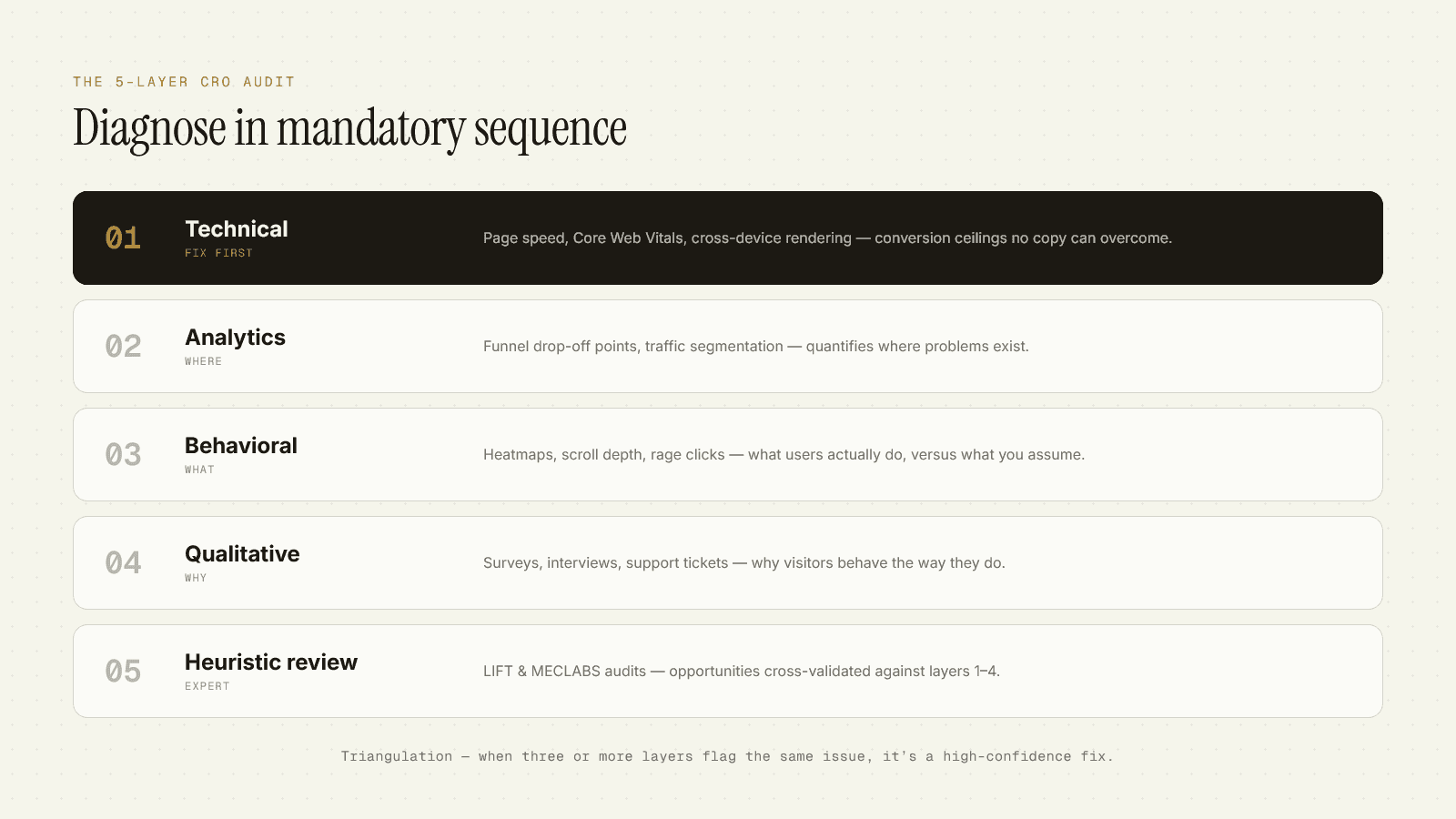
Professionals run a 5-layer diagnostic in mandatory sequence. Each layer produces different evidence, and the sequence prevents misdiagnosis.
Layer 1 — Technical Analysis (Fix First)
What you're checking
Page speed, Core Web Vitals, cross-browser/device rendering, mobile usability.
Why first
Technical issues are conversion ceilings no copy optimization overcomes.
Evidence
- Every 1-second delay = 7% conversion reduction (Akamai/Google)
- 3-second load time = >50% mobile abandon (Google)
- Core Web Vitals pass = 80-100% mobile conversion improvement (Redbus)
- Vodafone: 31% LCP improvement = 15% lead lift + 8% sales
If your page loads in 5 seconds on mobile, start here. The best headline in the world can't save a broken technical foundation.
Layer 2 — Analytics Analysis
What you're checking
Funnel visualization, drop-off points, traffic segmentation, device/source breakdown.
Output
Quantified WHERE problems exist.
Example: 40% drop-off at form submission. That's not a qualitative insight. That's a localized failure point you can now investigate.
Layer 3 — Behavioral Analysis
What you're checking
Heatmaps, click maps, scroll depth, rage clicks (repeated frustrated clicks on non-clickable elements), form interaction recordings.
Output
WHAT users actually do (vs. what you assume they do).
Example: Heatmap shows 60% of clicks on an image that looks like a button but isn't clickable. That's a false affordance — a design element that signals interactivity but doesn't deliver. Rage clicks confirm frustration.
Layer 4 — Qualitative Research
What you're checking: Surveys, user interviews, usability testing, chat logs, support tickets.
Output: WHY visitors behave as they do.
Analytics tells you 40% drop off at the form. Behavioral data shows rage clicks on the shipping calculator. Surveys tell you: "I couldn't figure out how much shipping would cost before entering my credit card."
Now you know the root cause. Add a shipping estimator above the form.
Layer 5 — Heuristic Expert Review
What you're checking
LIFT 6-factor audit, MECLABS heuristic (C = 4m + 3v + 2(i−f) − 2a), convergence gradient compliance.
Output
Expert-identified opportunities cross-validated against Layers 1-4.
Example: Expert review flags weak value proposition (LIFT). Analytics shows 70% bounce rate (Layer 2). Heatmaps show almost no scrolling past the first viewport (Layer 3). Surveys report "I didn't understand what you were selling" (Layer 4).
Four layers independently identify the same problem. Evidence is strong. Prioritization is high. Fix the value proposition first.
The Triangulation Principle
If multiple layers independently identify the same problem, evidence is strong and prioritization is high.
One layer flagging an issue = hypothesis.
Two layers = strong signal.
Three+ layers = high-confidence fix.
Example:
- Layer 2 (Analytics): 40% checkout drop-off
- Layer 3 (Behavioral): Rage clicks on shipping calculator
- Layer 4 (Qualitative): "Couldn't calculate shipping before entering payment"
- Layer 5 (Expert): Missing shipping estimator violates friction-reduction principle
Four-layer convergence. The fix is obvious. Add a shipping estimator.
PXL Binary Prioritization: How to Rank What to Test
You've run the 5-layer audit. You have 12 hypotheses. Which do you test first?
Most teams use PIE (Potential, Importance, Ease) or ICE (Impact, Confidence, Ease) scoring. You rate each hypothesis 1-10 on three dimensions, average the scores, and rank.
The problem: 1-10 scales invite central tendency bias. Everyone defaults to 5-7. The scores feel scientific but aren't.
PXL (from CXL) replaces subjective 1-10 scoring with 10 weighted binary (true/false) questions. Each question is worth 1 or 2 points. You can't hedge.
The 10 Questions
Ease is scored by estimated implementation hours (bracketed), not vague difficulty ratings. <4 hours, 4-8 hours, >8 hours.
Why PXL > PIE/ICE
- Binary scales eliminate hedging. You can't rate something a 6.5. It's true or false.
- Requires actual data. Ideas without quantitative or qualitative backing score lower automatically.
- Higher win rates. CXL reports better test success rates with PXL vs. PIE/ICE.
Worked Example
Hypothesis: Add shipping estimator above checkout form.
Total: 12 points
Ease: 4-8 hours (simple calculator widget)
High score + low implementation effort = test immediately.
Statistical Rigor: Why Your 15% Lift Probably Isn't Real
You ran an A/B test. Variant B beat control by 15%. You shipped it. Three weeks later, conversions are back to baseline.
What happened?
The Peeking Problem.
You checked the test results daily. On day 10, the test showed "statistically significant" at p=0.04. You stopped the test and declared victory.
Quantified error inflation
Here's what you didn't know: checking results repeatedly and stopping when "significant" inflates false positive rates dramatically.
Netflix research: 70% of simulated A/B tests show false significance at some point, despite a true null hypothesis (no real difference between variants).
Translation: if you peek daily and stop when p<0.05, you have a 70% chance of shipping a false positive.
Pre-Specify Sample Size
Five variables must be locked BEFORE you start any test:
- Baseline Conversion Rate (BCR) - your current performance
- Minimum Detectable Effect (MDE) - what lift makes the test worth running (typically 5-20% relative)
- Statistical Power - probability of detecting a real effect (80% standard)
- Significance Level - false positive tolerance (α = 0.05 standard)
- Sample Size (n) - calculated from the above
Worked example
- BCR = 2%
- MDE = 5% relative lift (2% → 2.1%)
- α = 0.05, power = 0.80
- Required sample size: ~1,216 visitors per variant
Run the test until you hit 1,216 per variant. Don't peek. Don't stop early.
Minimum duration: 2 full business cycles (2-4 weeks) to capture day-of-week effects and novelty effect regression.
Kohavi's Reality Check
Ron Kohavi ran tens of thousands of A/B tests at Bing and Microsoft. His empirical finding:
- Only 2 experiments produced >10% revenue lift. Typical lifts: 0.1-2%.
- Lifts >10% from a single change warrant skepticism. They're more likely artifact (peeking problem, Simpson's Paradox, small sample) than real effect.
Publication bias inflates reported case studies. The 300% lift you read about in a blog post is survivorship bias. The dozens of tests that produced 0.3% lifts don't get written up.
What MarketerX Does with This
Every framework, every factor, every diagnostic layer, every convergence principle in this post is baked into MarketerX's landing page generation and audit protocol.
When you ask MarketerX to build a landing page, it:
- Runs the 8-factor page length matrix (awareness stage, traffic temp, price, complexity, form fields, traffic source, B2B/C, device) and determines optimal structure before writing a single word.
- Applies the 6-framework convergence gradient — enforces 6/6 universal principles, defaults to 4/6 strong principles unless you override, makes strategic choices on 3/6 moderate principles based on your offer type.
- Generates architecture-first — section ordering, fold strategy, CTA placement, mobile compression before copy.
- Writes copy calibrated to the architecture — headline clarity for above-fold, belief-breaking for mid-page, objection handling before CTA.
- Runs the LIFT diagnostic + PXL prioritization if you ask it to audit an existing page.
You don't have to remember the 8 factors or the convergence gradient or the 4-tier testing hierarchy. MarketerX remembers.
The depth in this post isn't trivia. It's the operational substrate that makes the difference between a 2% landing page and a 6% landing page.
And 2% → 6% isn't "better performance." It's 3× the revenue from the same traffic.
Want MarketerX to audit your landing page against this framework? Sign up at marketerx.com. The convergence audit runs automatically on every page you generate or upload.